ReviveYou Logo
IV drip infusion is a growing method of hydration where the body can absorb liquids faster than drinking. I was recently asked to design a logo for a local hydration business called ReviveYou. The owner is a nurse who’s eventually looking to turn this side-hustle into their full-time job. After an exploratory interview and research, I provided some initial concepts and directions.
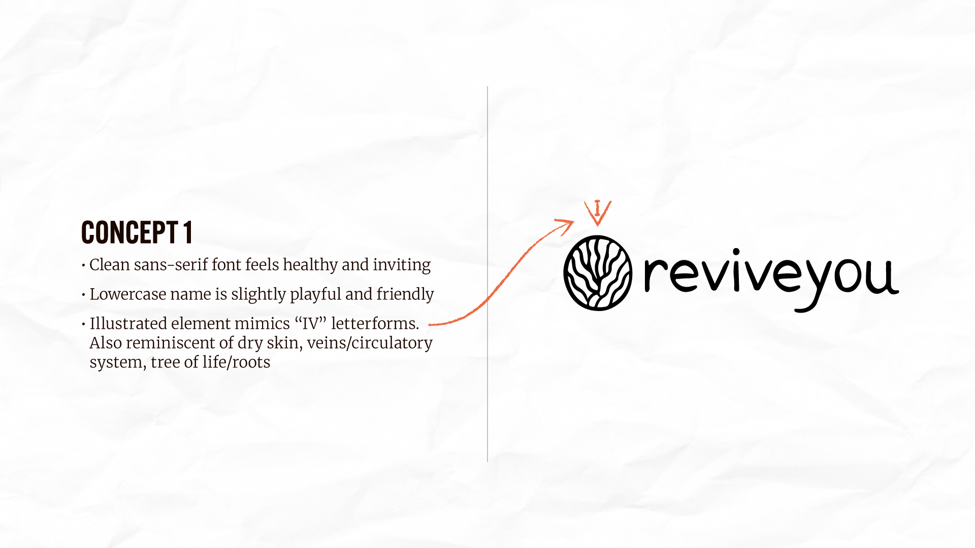
The client was drawn to Concept 1, specifically how the icon subtly mimics the motion of “IV” letterforms. It’s a touch that might go unnoticed by most, but has a conceptual tie-in to the cornerstone of their business. We moved forward to with that direction, starting with icon development.
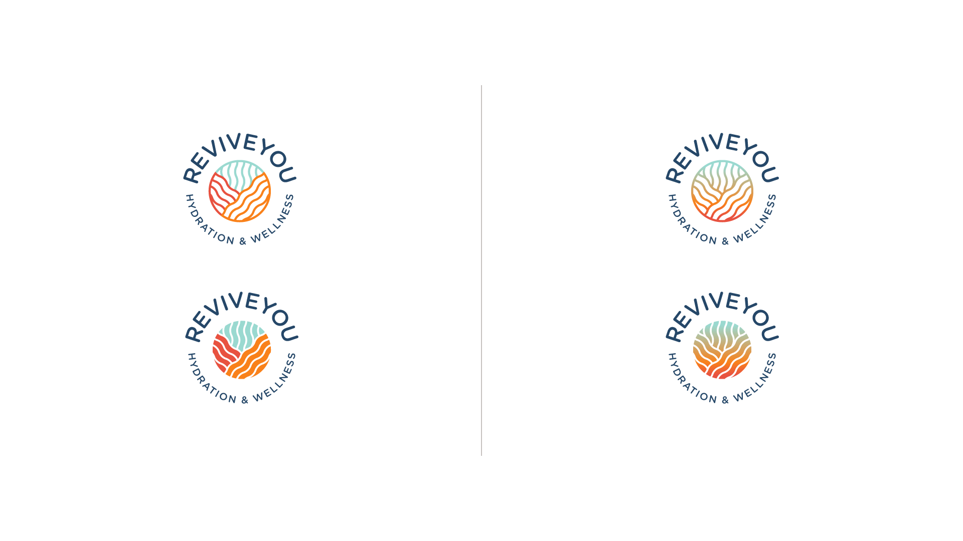
In the brief, the client mentioned wanting to stay away from cliché water droplet imagery and create something bright, clean, and colorful. The icon takes clear inspiration from the motion and waves created by water. After a few rounds of refinement, we landed on a harmonious mark that evokes feelings of being enveloped or healed by fluids. With the mark complete, we moved on to typography.

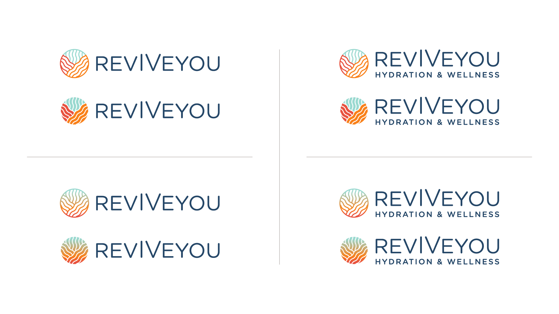
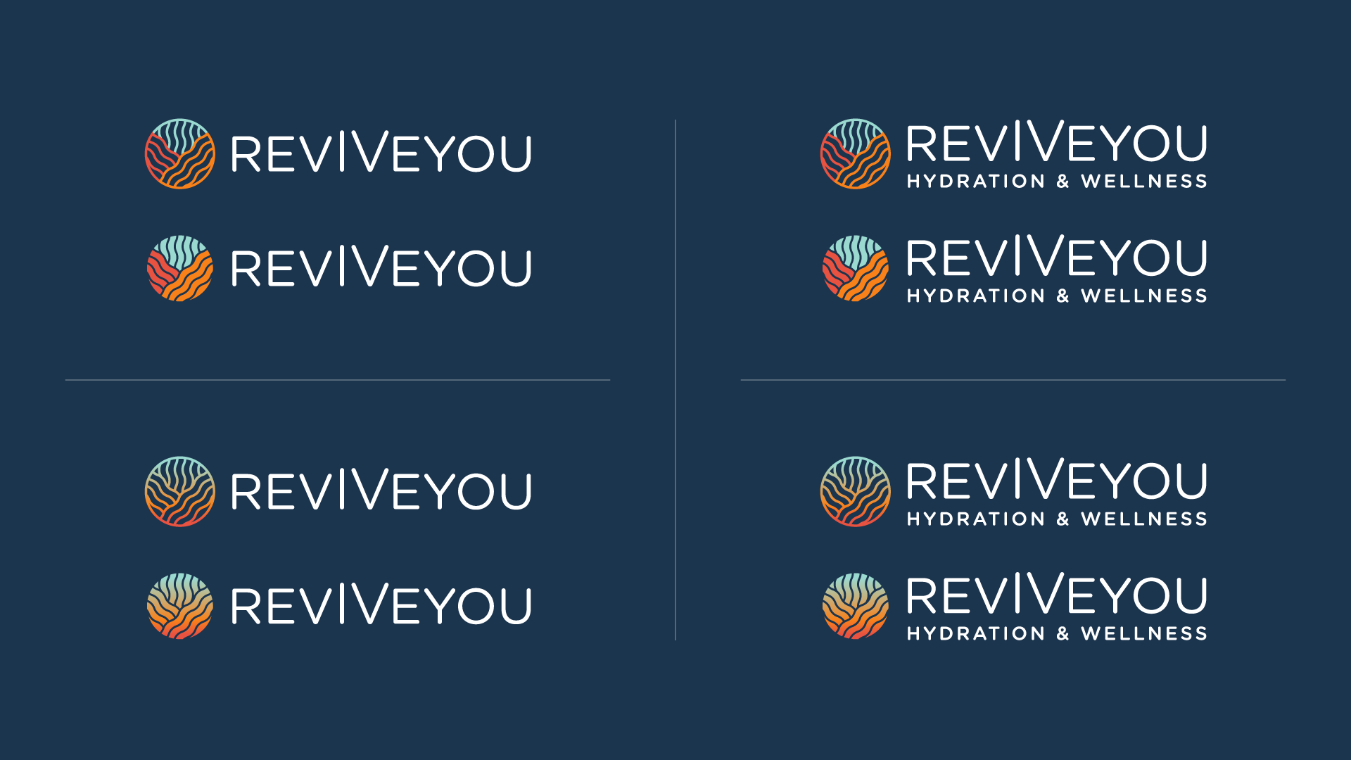
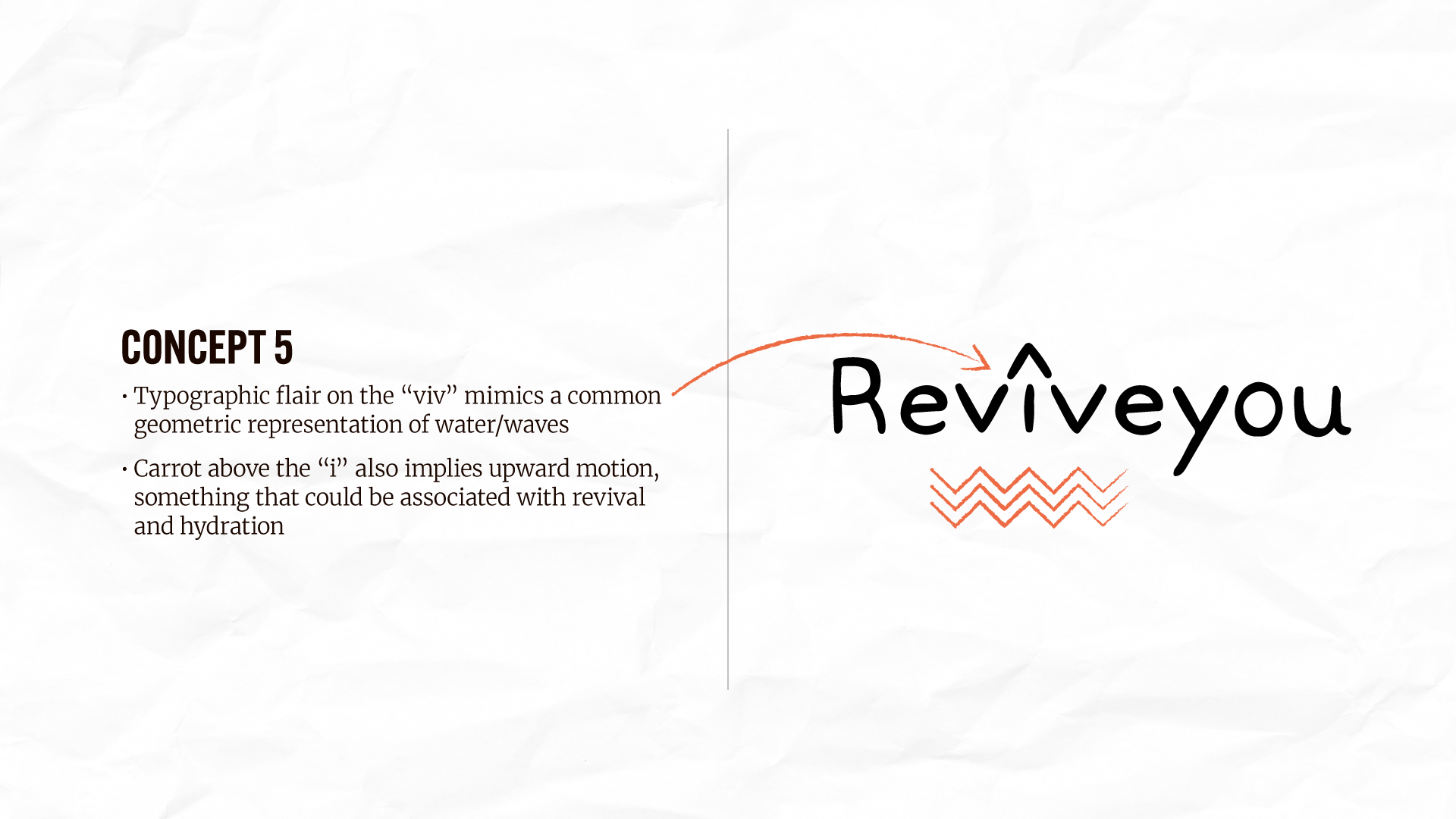
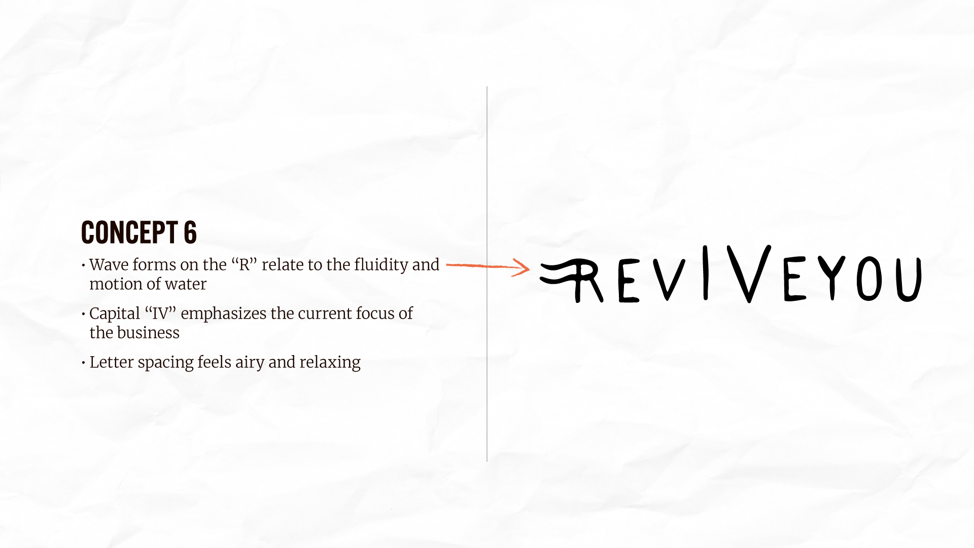
The typography is fairly straightforward. We landed on an approachable, rounded sans-serif typeface (Gotham Rounded from Hoefler & Co.) with one important tweak: the elevation of the “IV” characters in the wordmark. This is another subtle way to highlight the essence of the business.

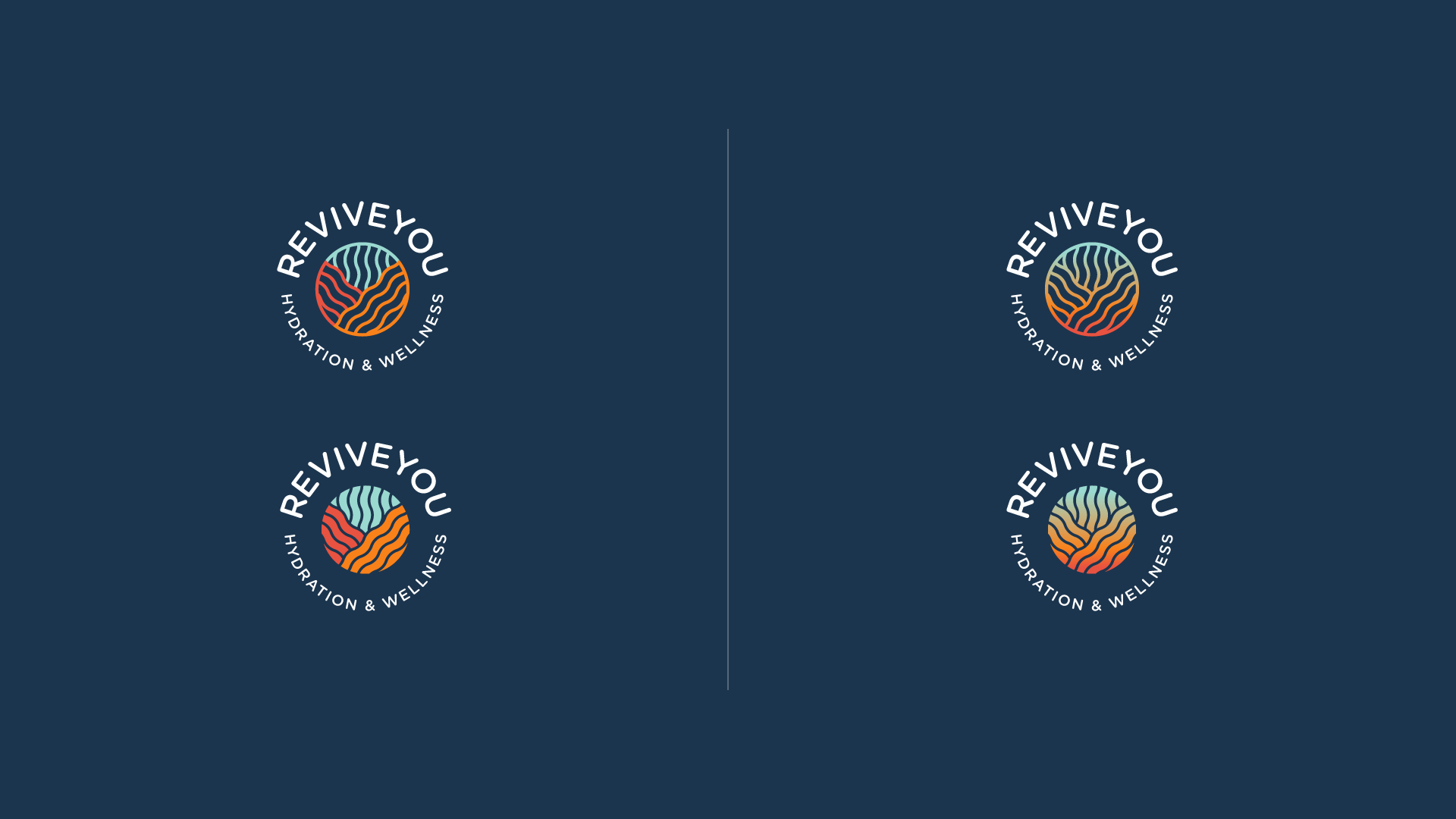
Even with color, the client wanted to stay away from the expected. They were still open to traditional water tones, but wanted some warm colors in their palette to provide flexibility.

With all the elements in place, we assembled the final suite of logos. I like to provide maximum flexibility for my clients, so the final set included quite a few variations.